GOGO squeeZ
UNLOCKING GROWTH WITH DESIGN
BACKGROUND
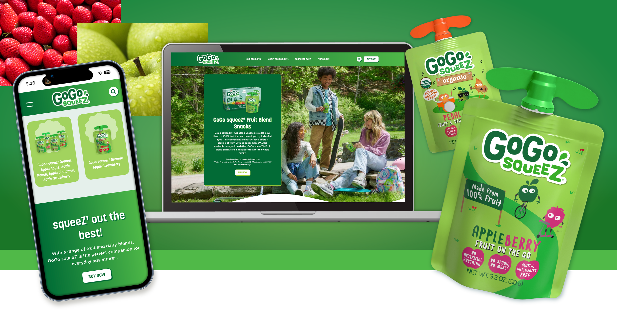
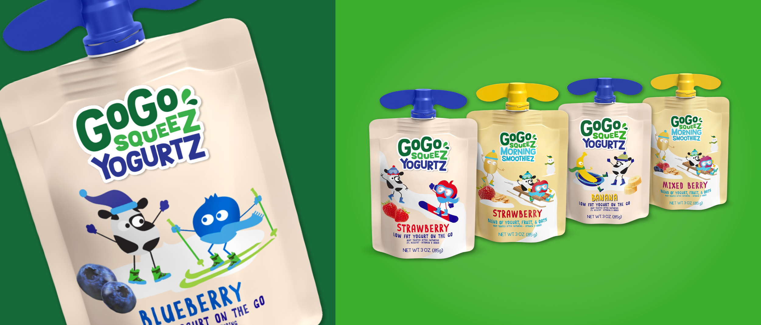
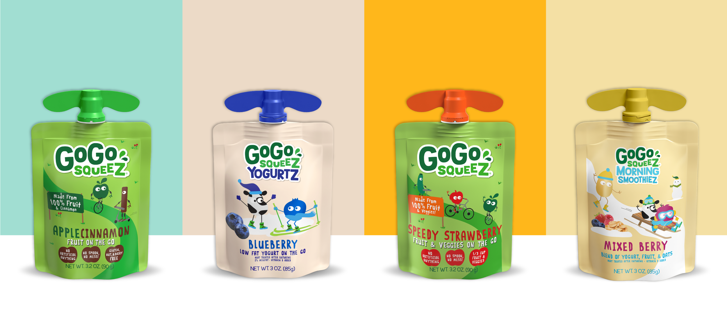
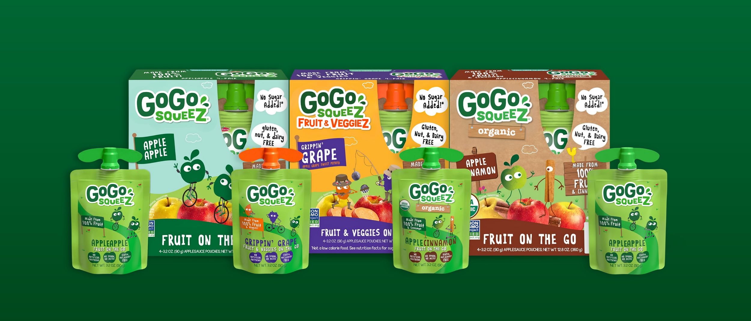
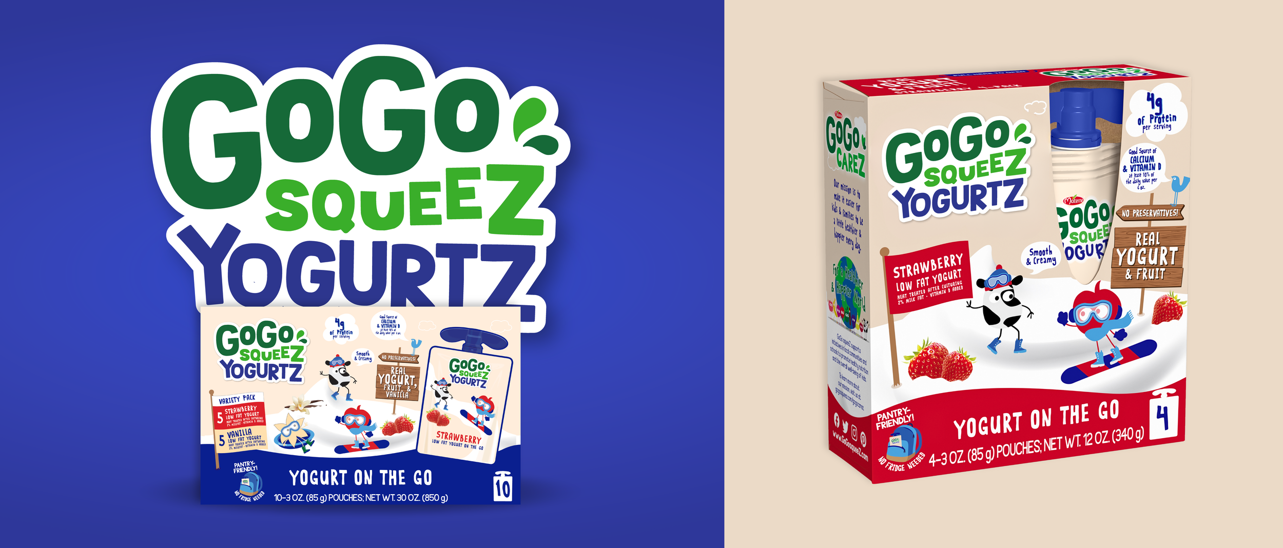
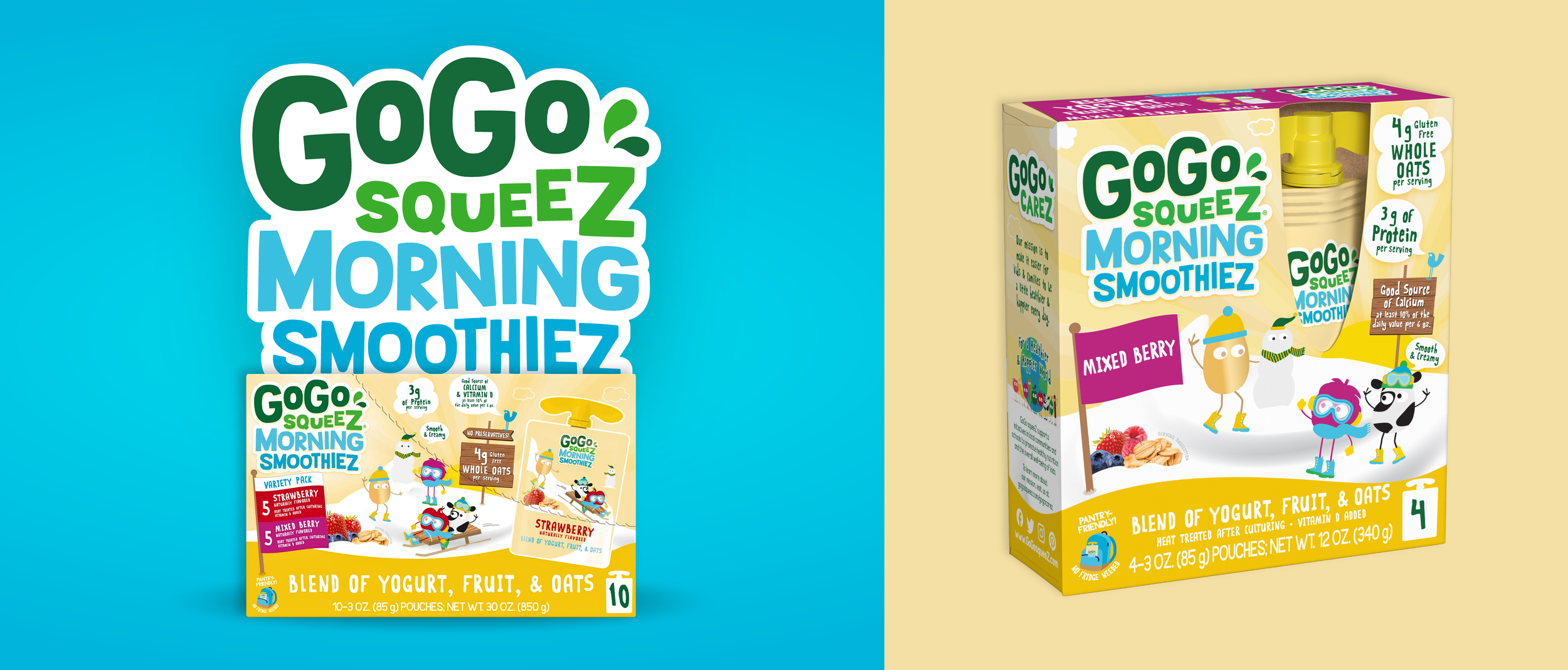
In 2008, GoGo squeeZ changed the US applesauce and fruit cup category forever when it launched applesauce pouches. This disruptive new format quickly captured hearts, bellies, and a tremendous amount of market share. Over the next 10 years, GGS expanded their portfolio, launching organic blends, fruit and veggie blends, and innovative shelf-stable yogurt– as well as countless new flavors, combo packs, club packs, and thematic packs. During that 10 year period of innovation and rapid expansion, the brand’s focus was on launching items in exciting packs that stood out on shelf. With each launch, though, the brand block became more scattered and inconsistent– and with a pipeline full of innovative products that would further stretch the portfolio and brand, GGS knew it was time to establish a unified (and future-proofed) packaging design system.
THE WORK
WHAT WE DID
PROJECT MANAGEMENT
RESEARCH AND INSIGHTS
BRAND STRATEGY
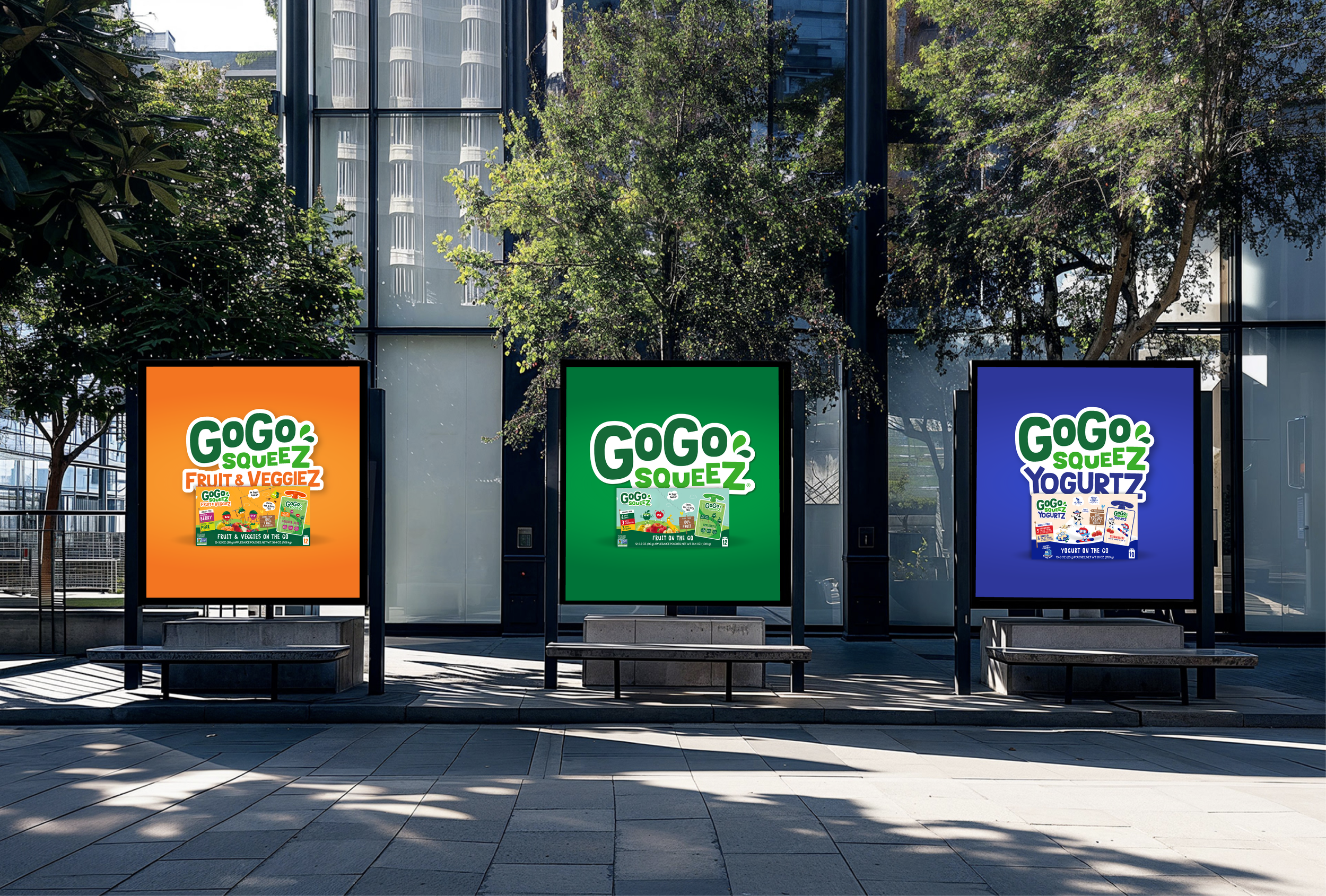
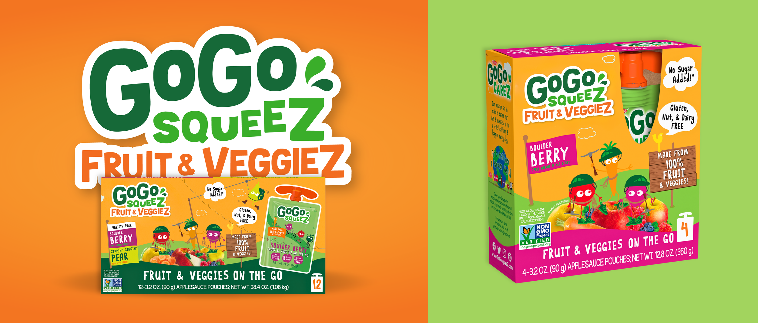
PORTFOLIO ARCHITECTURE
CREATIVE DIRECTION
DESIGN STRATEGY
ART DIRECTION
2D AND 3D PACKAGING DESIGN
VISUAL IDENTITY SYSTEM
SALES ENABLEMENT
360 ACTIVATION
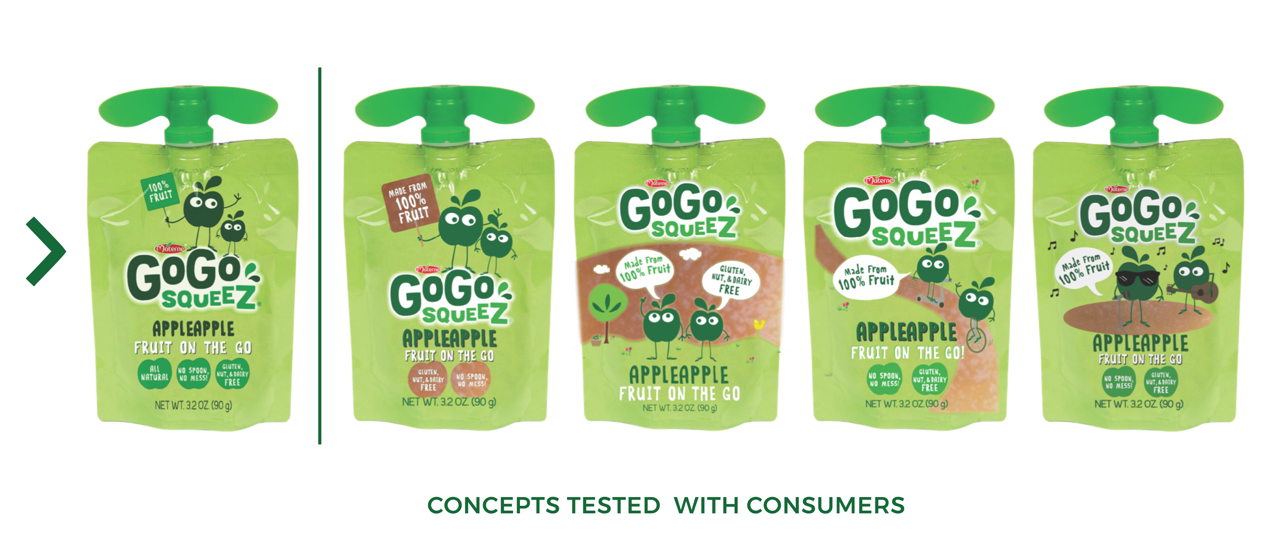
Going from unknown challenger brand to indisputable category leader in less than 10 years was quite a feat. Getting both executives and consumers on board with significant design changes to a beloved brand would also be quite a feat– but we knew that, if executed correctly, GoGo squeeZ would become the category’s beacon brand. So first, we focused on sharpening our strategic approach.
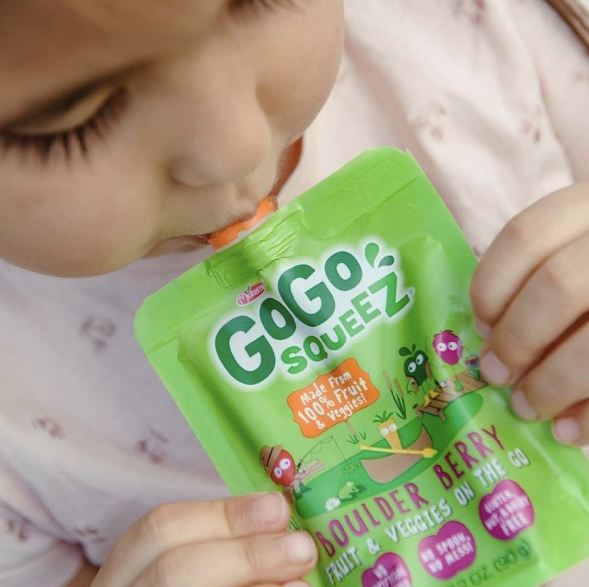
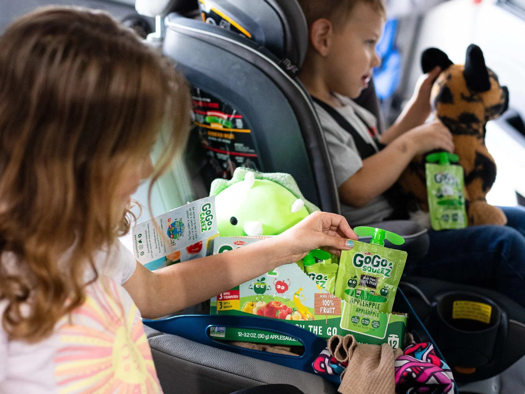
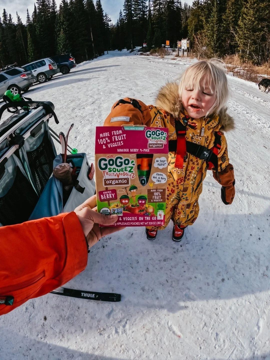
We talked extensively with parents and caregivers of young snackers and began to better understand their unique ‘dual-consumer' experience. Essentially, this: 1) There is an adult who interacts with the outer packaging and ultimately evaluates the product for purchase for their little one; and 2) There’s a child who interacts with the individual, inner packaging and ultimately consumes the product at home, at school, socially, etc. This knowledge, that we were actually crafting a dual-consumer experience, inspired boundless creativity and influenced every choice we made throughout the design process.
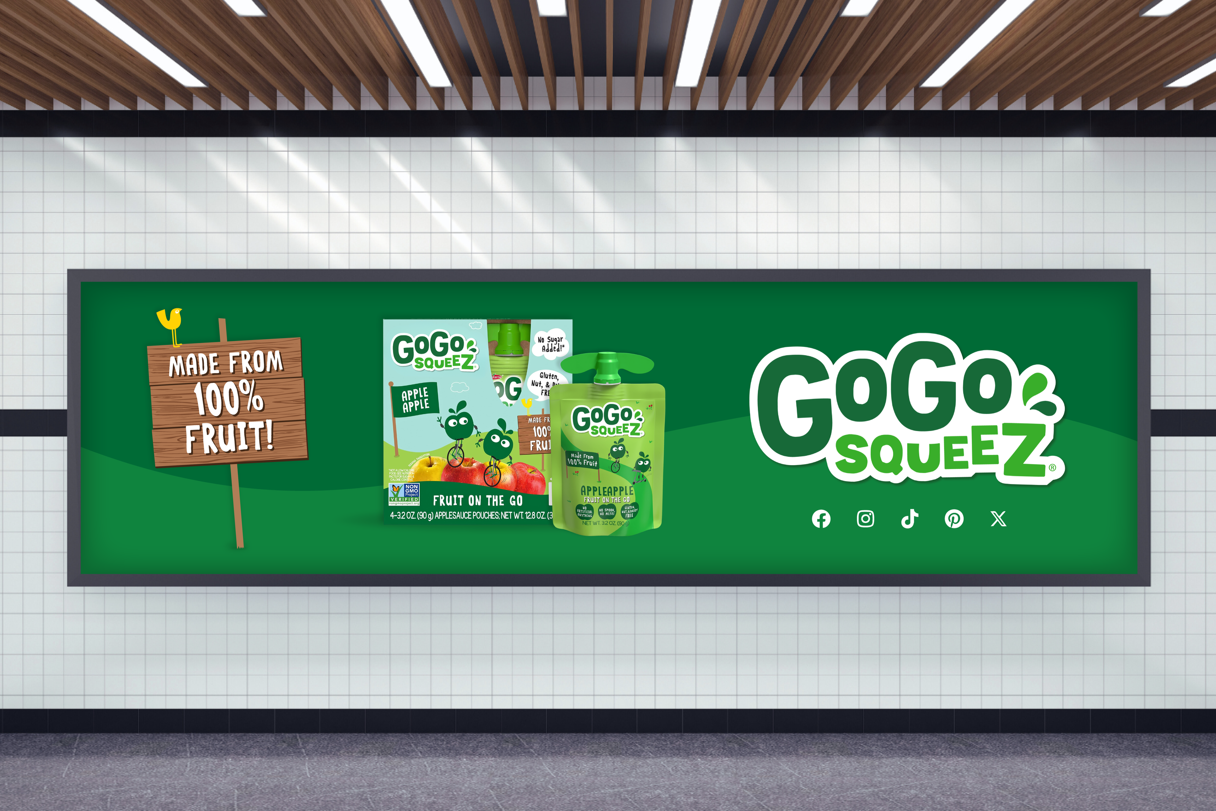
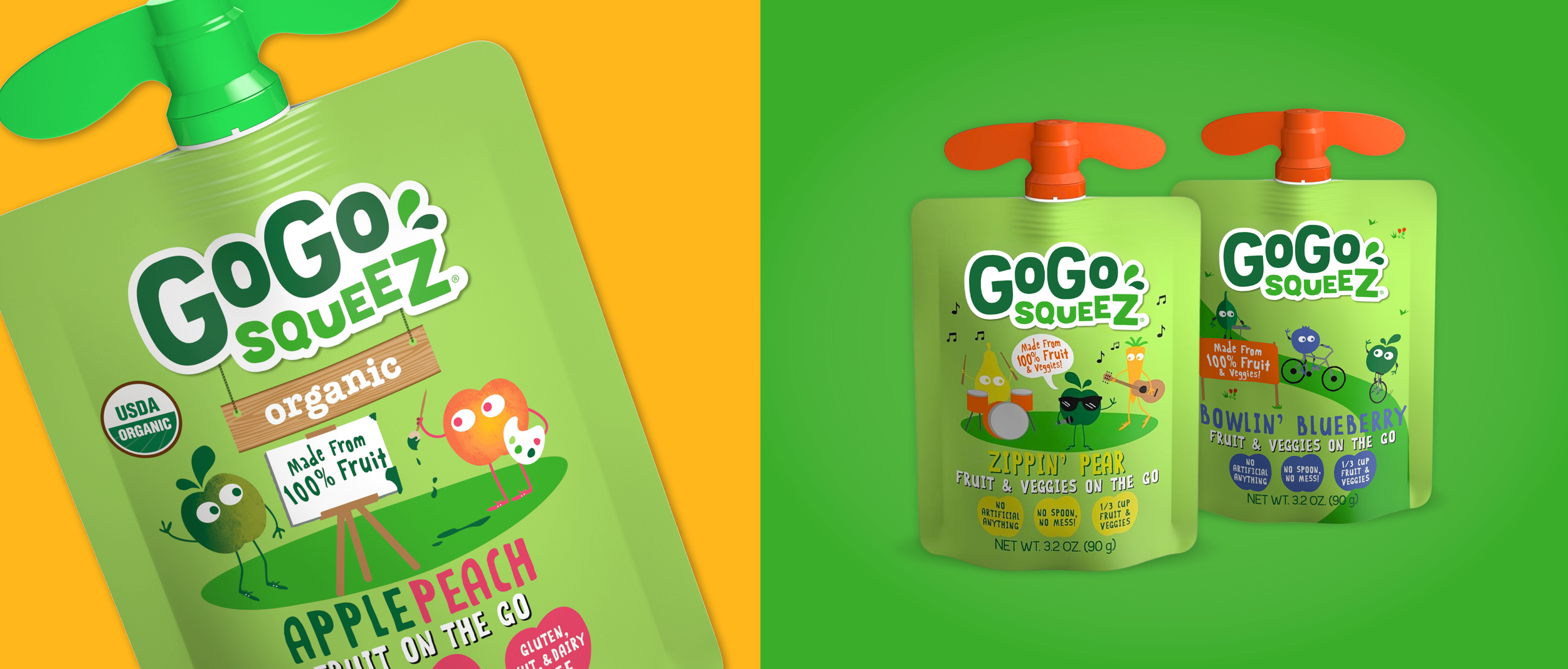
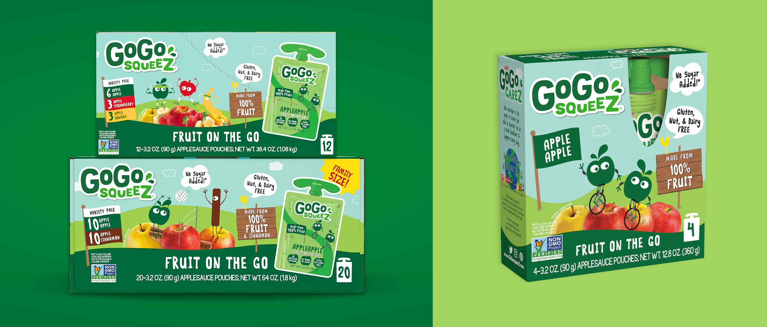
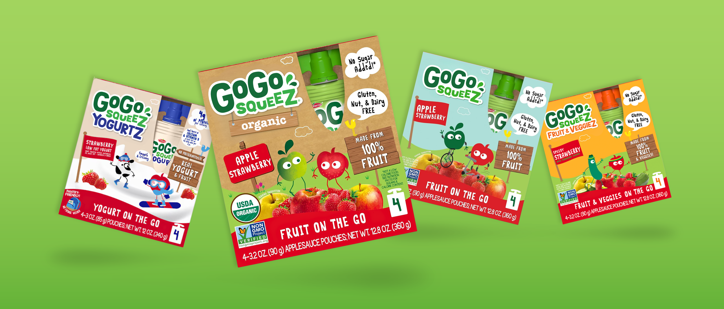
For our adult audience, we focused on making their overall experience with our products better and easier. We organized the portfolio architecture, established communications hierarchies, clarified our messaging, and made sweeping updates that delivered a more consistent, reliable, and enjoyable experience.
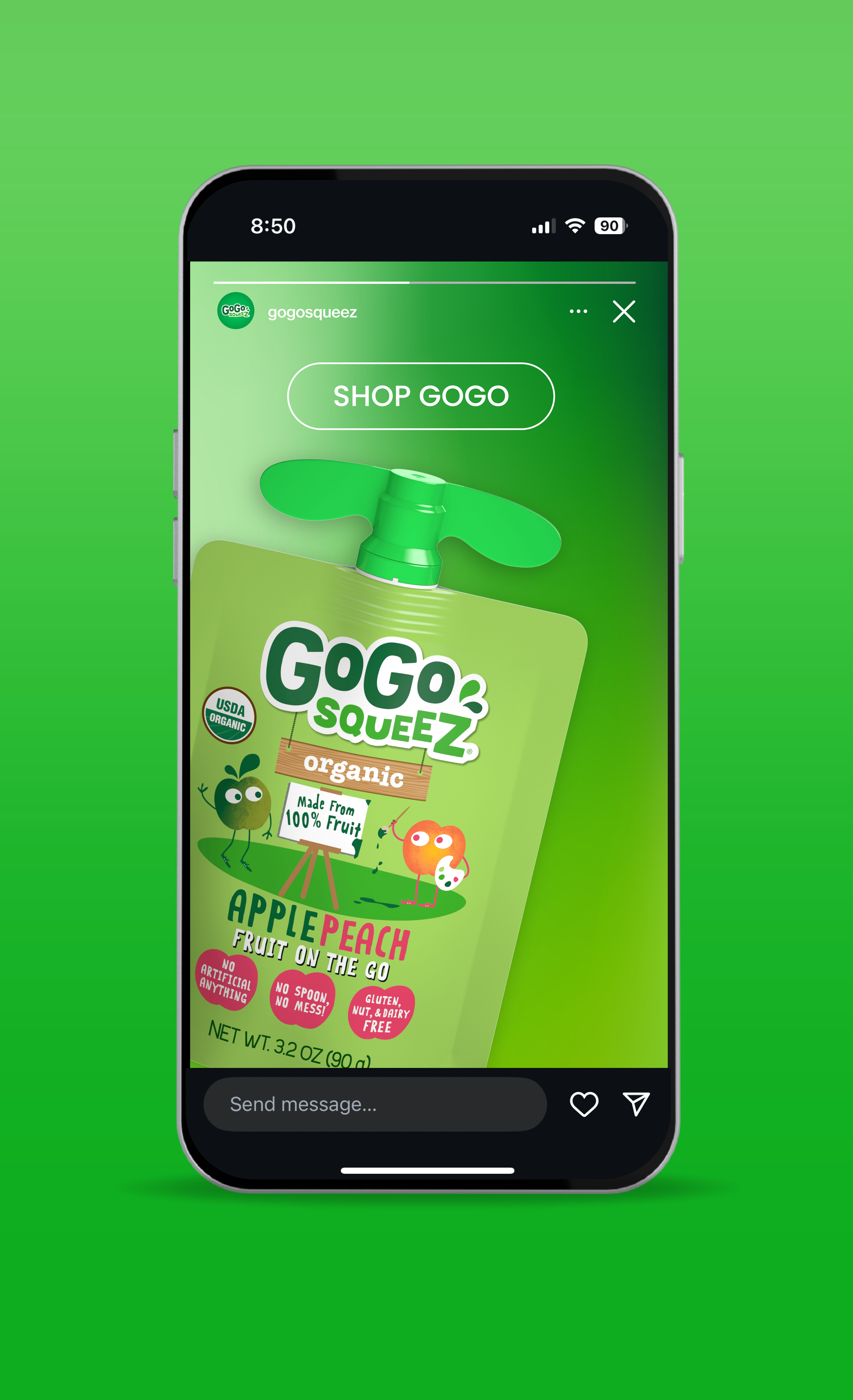
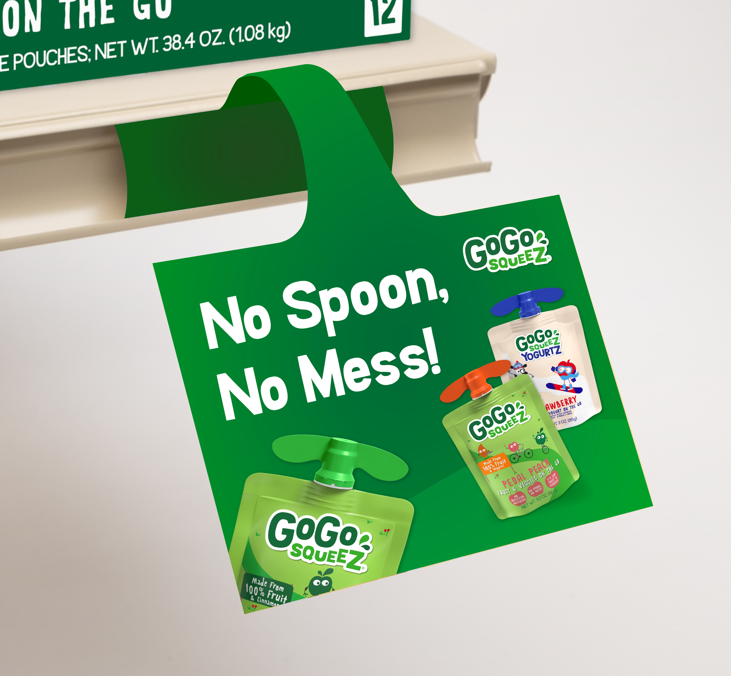
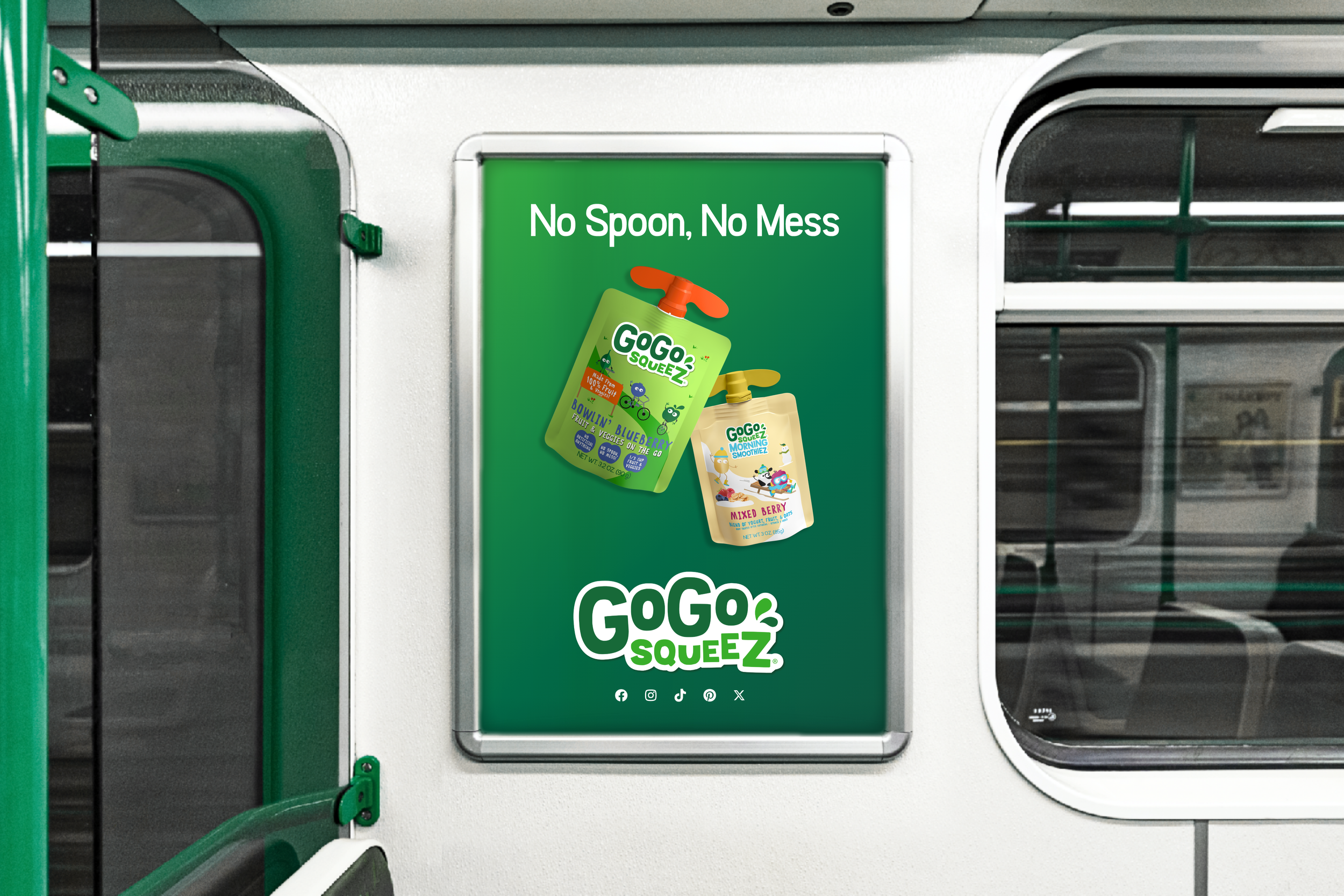
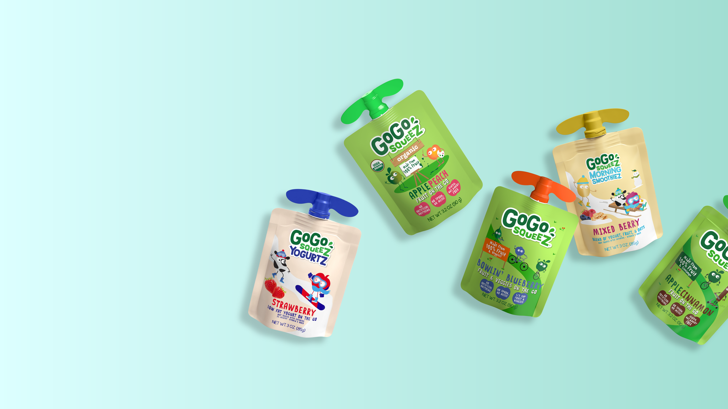
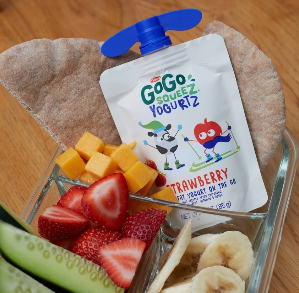
For our kid audience, our actual product consumers, we dialed up the visual cues and the playfulness. Our goal with every designed element was to surprise and delight our little ones, while making it easy for them to find their desired flavor or version even if they couldn’t yet read. We focused on creating a more vibrant and dynamic visual experience (with elements like silly jokes on the bottoms of all pouches!) and decreased the prominence of elements that kid’s don’t care about (like our logo and long lists of claims).
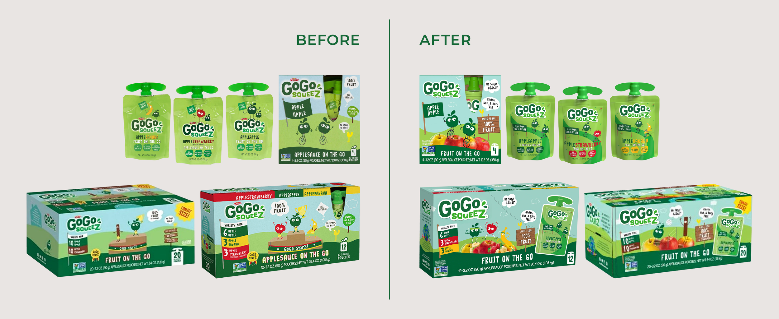
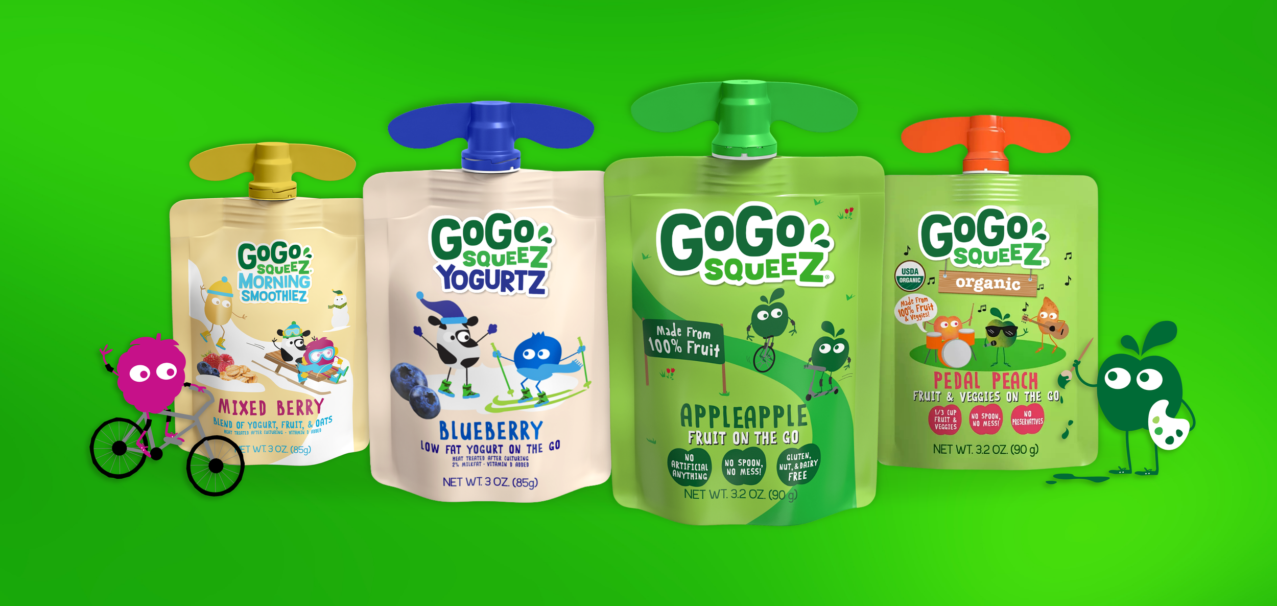
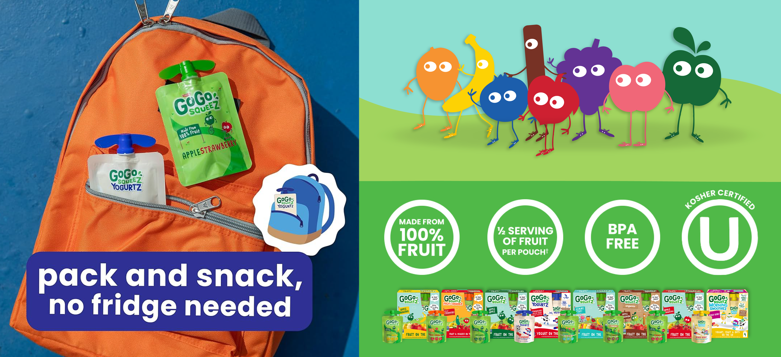
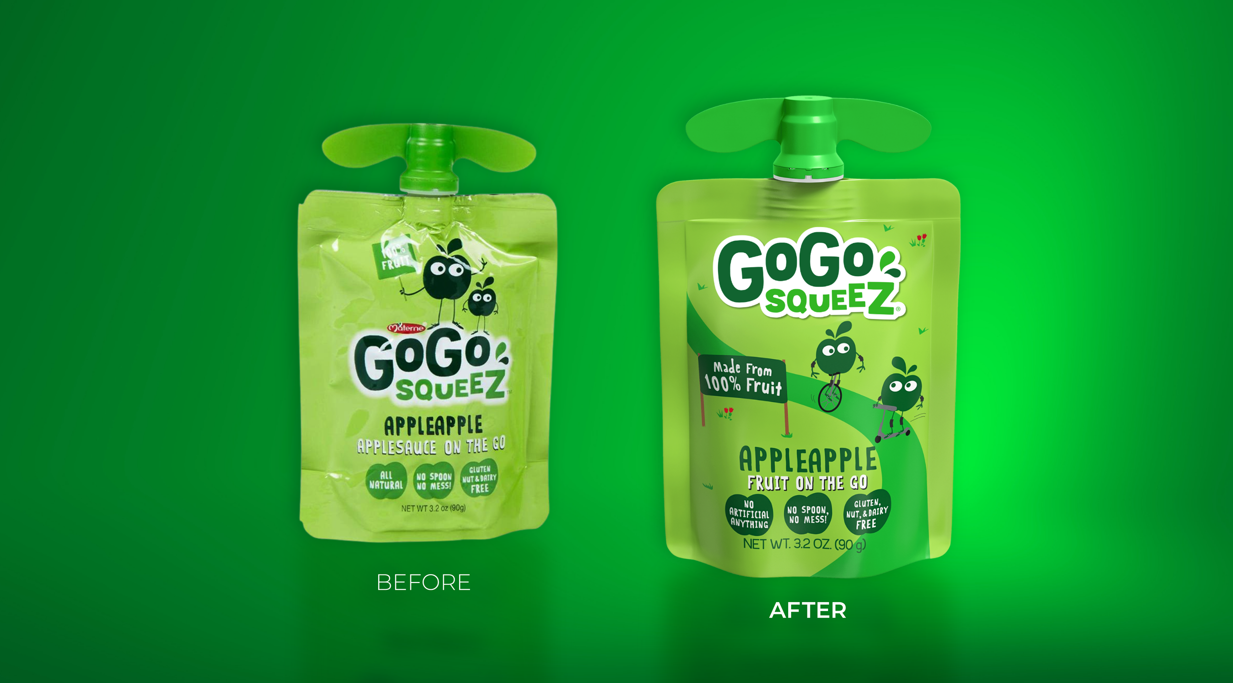
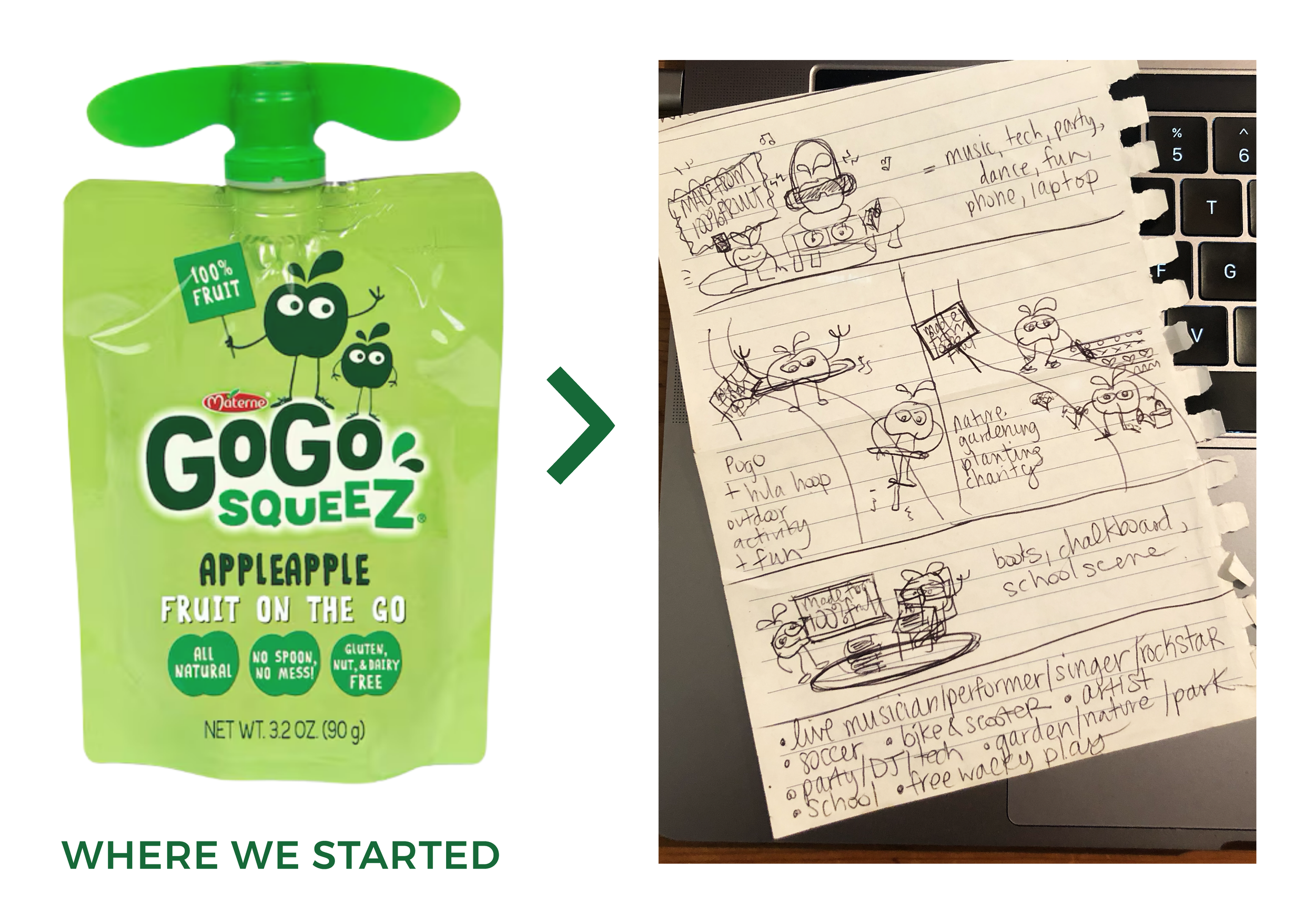
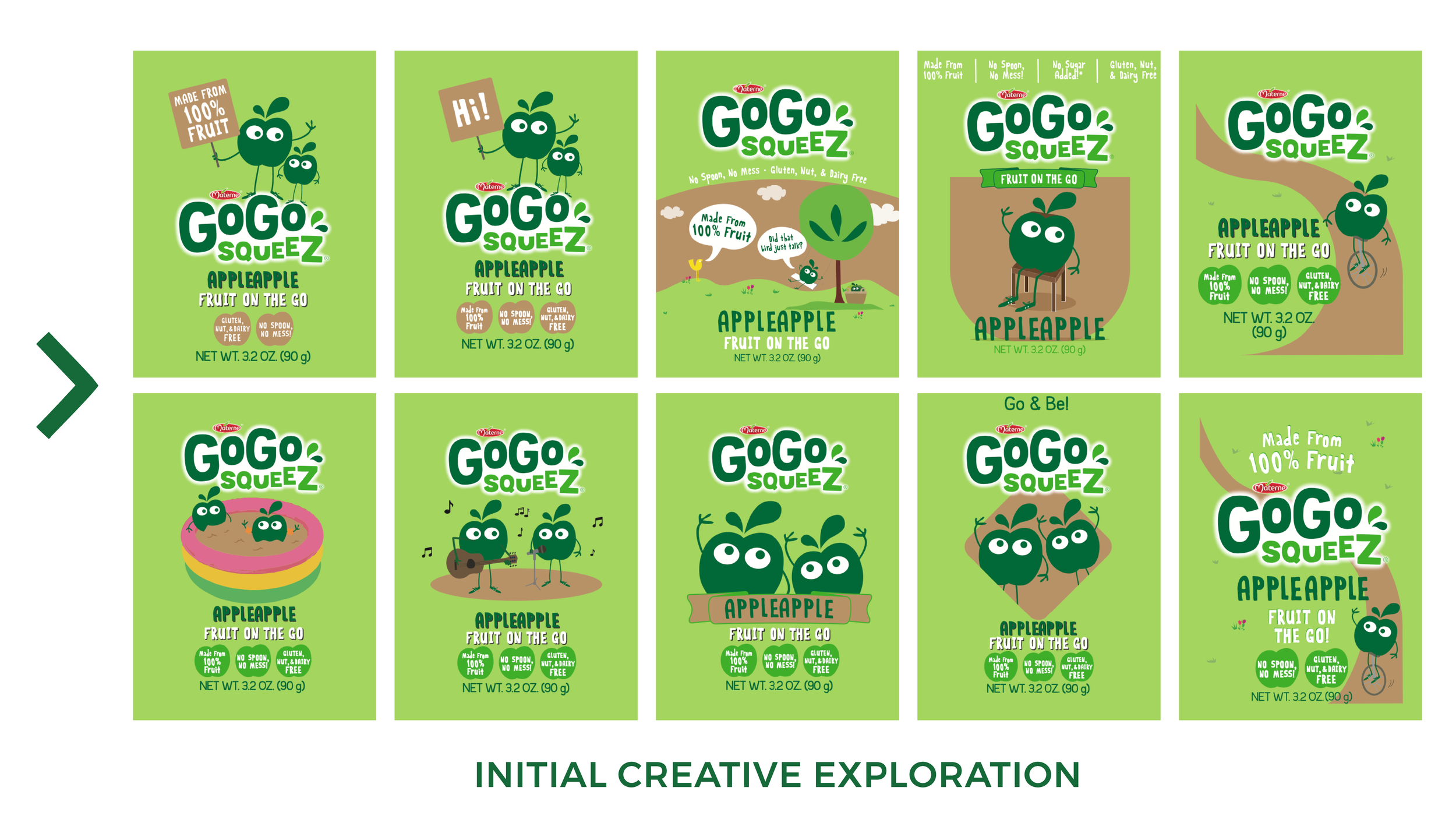
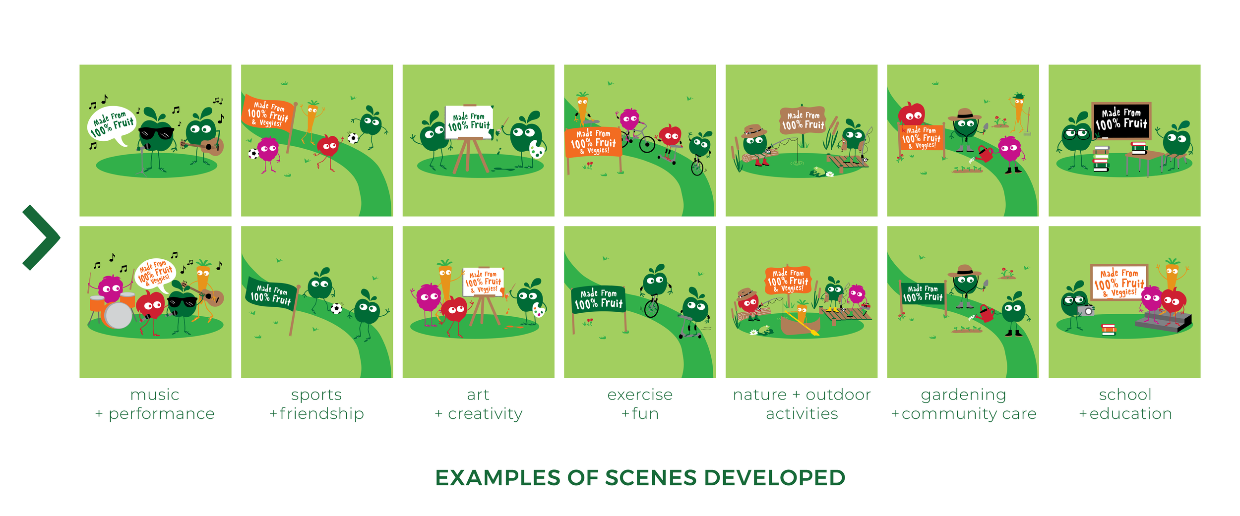
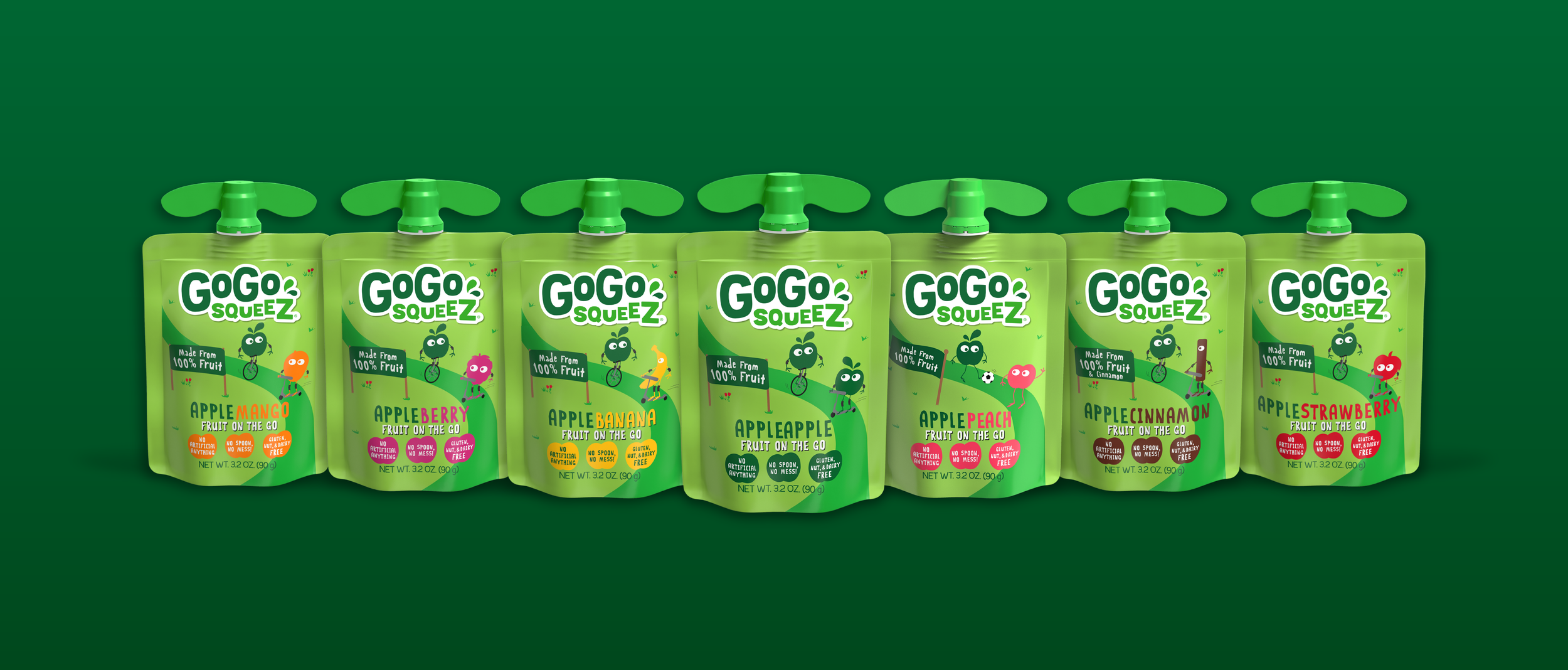
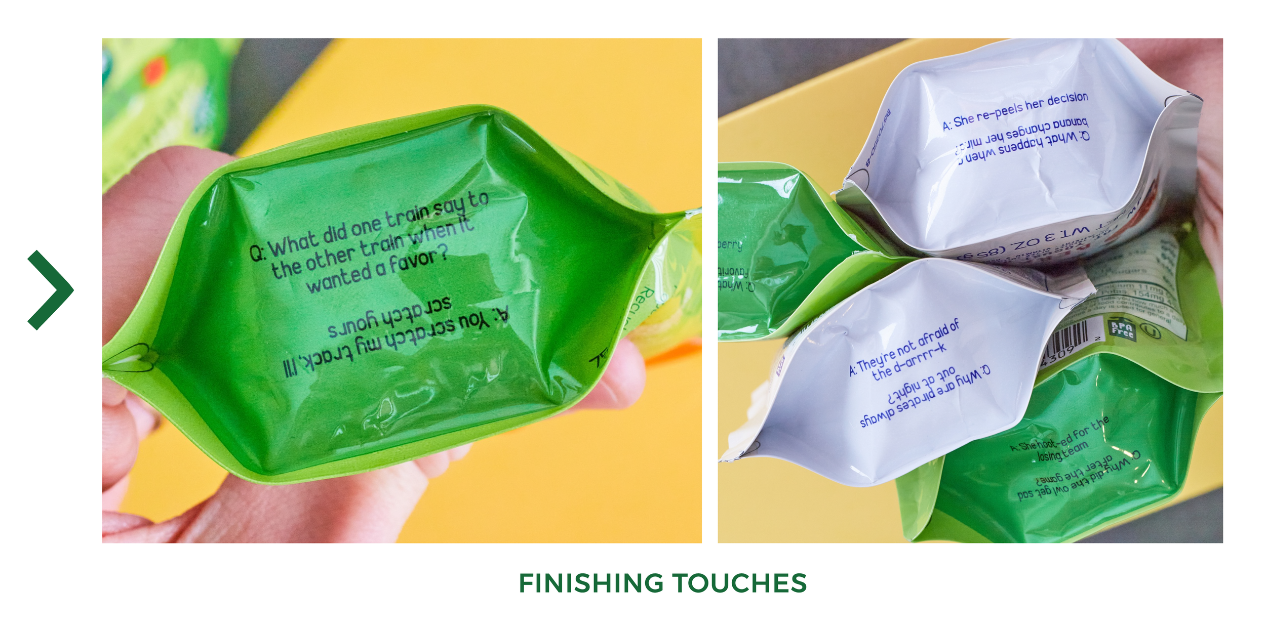
We worked closely with our R&D and manufacturing partners to push the fun further– like finding a way to print hundreds of silly jokes on the pouch bottoms, and discovering that each flavor could actually have up to 7 different pouch designs instead of just 1 (which ultimately meant every box of GoGo would deliver a uniquely exciting product experience for the little snacker!) We also pivoted within the design system in the later stages of the refresh, as we learned that our applesauce’s shelf life would be affected adversely by incorporating clear windows to show the product inside. I simply updated the design to fill the clear portions with a complementary brand color, and we were able to proceed without issue.
RESULTS AND IMPACT
After rolling out the comprehensive GoGo squeeZ master brand redesign in Q1 2020, we enjoyed undeniable improvements across nearly every brand metric. The optimized visual identity system accelerated brand growth and helped pave the way to being acquired by BEL Group in Q1 2022.
BEST YEAR EVER: Delivered company’s most profitable YTD (2020)
TANGIBLE GROWTH: Achieved highest ever household penetration (70%)
REVENUE RESULTS: After 18 months in market, sales had increased 30%
KEY EQUITY DRIVER: Delivered improvements to brand loyalty, awareness, and preference metrics