
GOGO squeeZ
bold
vibes
for
big kids
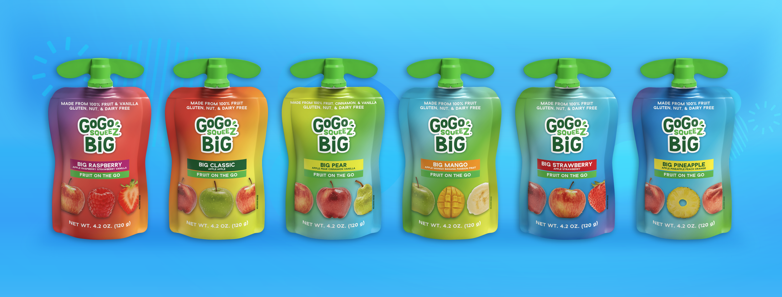
BACKGROUND
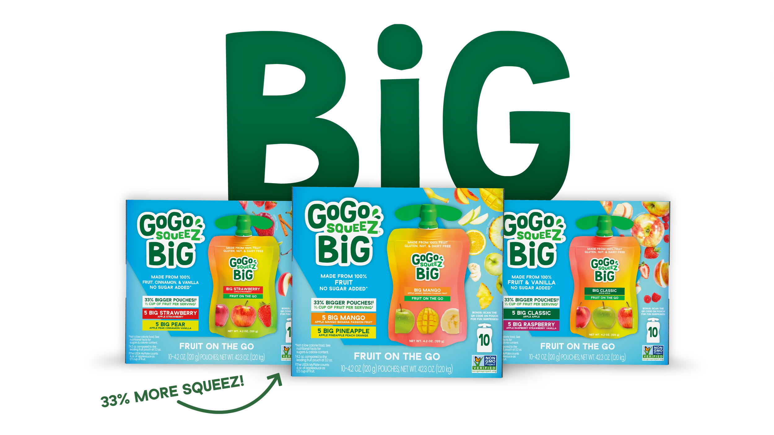
GoGo squeeZ needed to relaunch their declining ‘older kids’ portfolio range under a new visual identity. This would be the third rendition of this line; both previous attempts, despite being handled by external design agencies, ultimately failed in market. So, with no budget, a very tight timeline, and the entire range at risk of discontinuation, the project brief landed on my desk.
THE WORK
WHAT WE DID
PROJECT MANAGEMENT
CATEGORY AUDIT
RESEARCH AND INSIGHTS
BRAND STRATEGY
PORTFOLIO ARCHITECTURE
CREATIVE DIRECTION
2D AND 3D PACKAGING DESIGN
NEW PRODUCT DEVELOPMENT INNOVATION
DESIGN STRATEGY
BRAND WORLD / VISUAL IDENTITY
SALES ENABLEMENT
360 ACTIVATION STRATEGIES
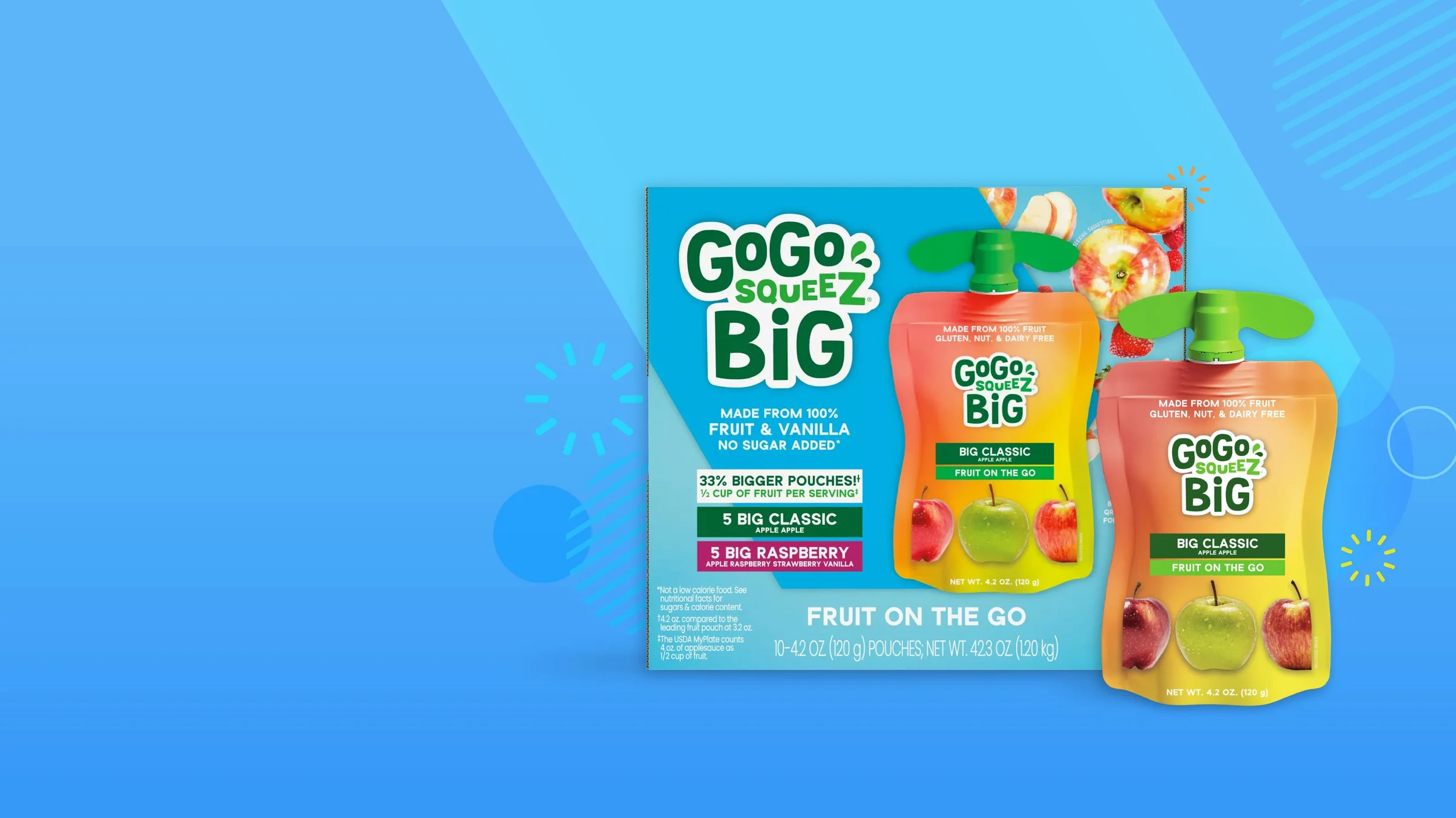
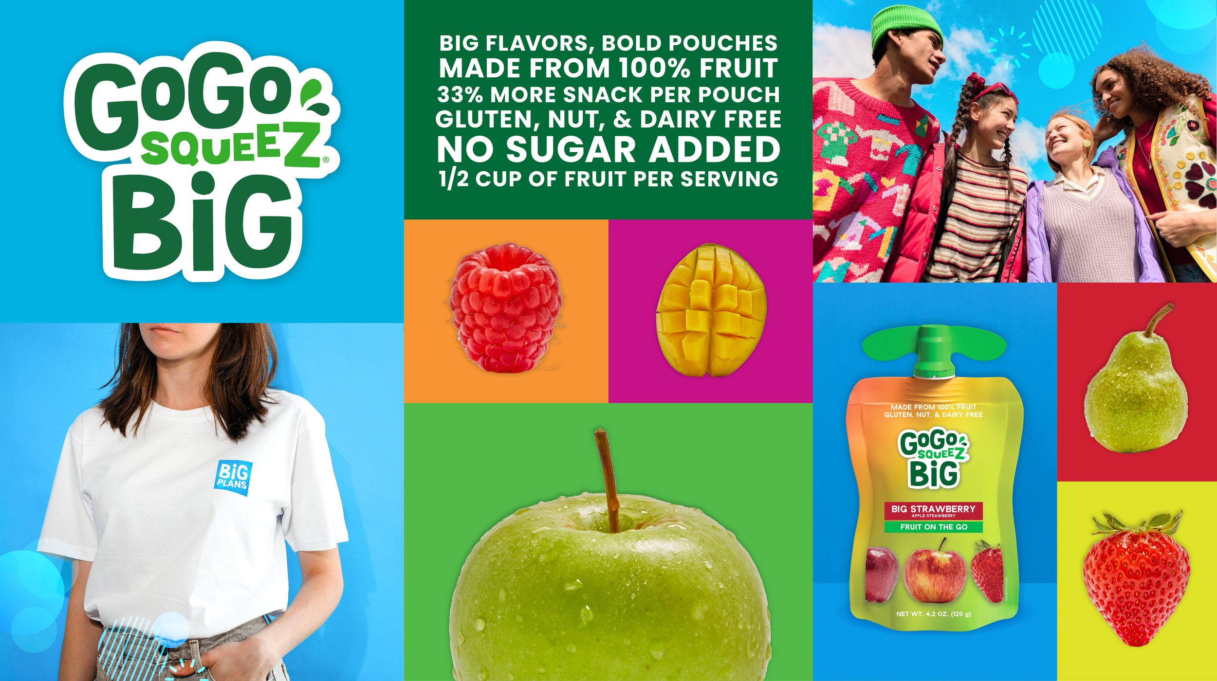
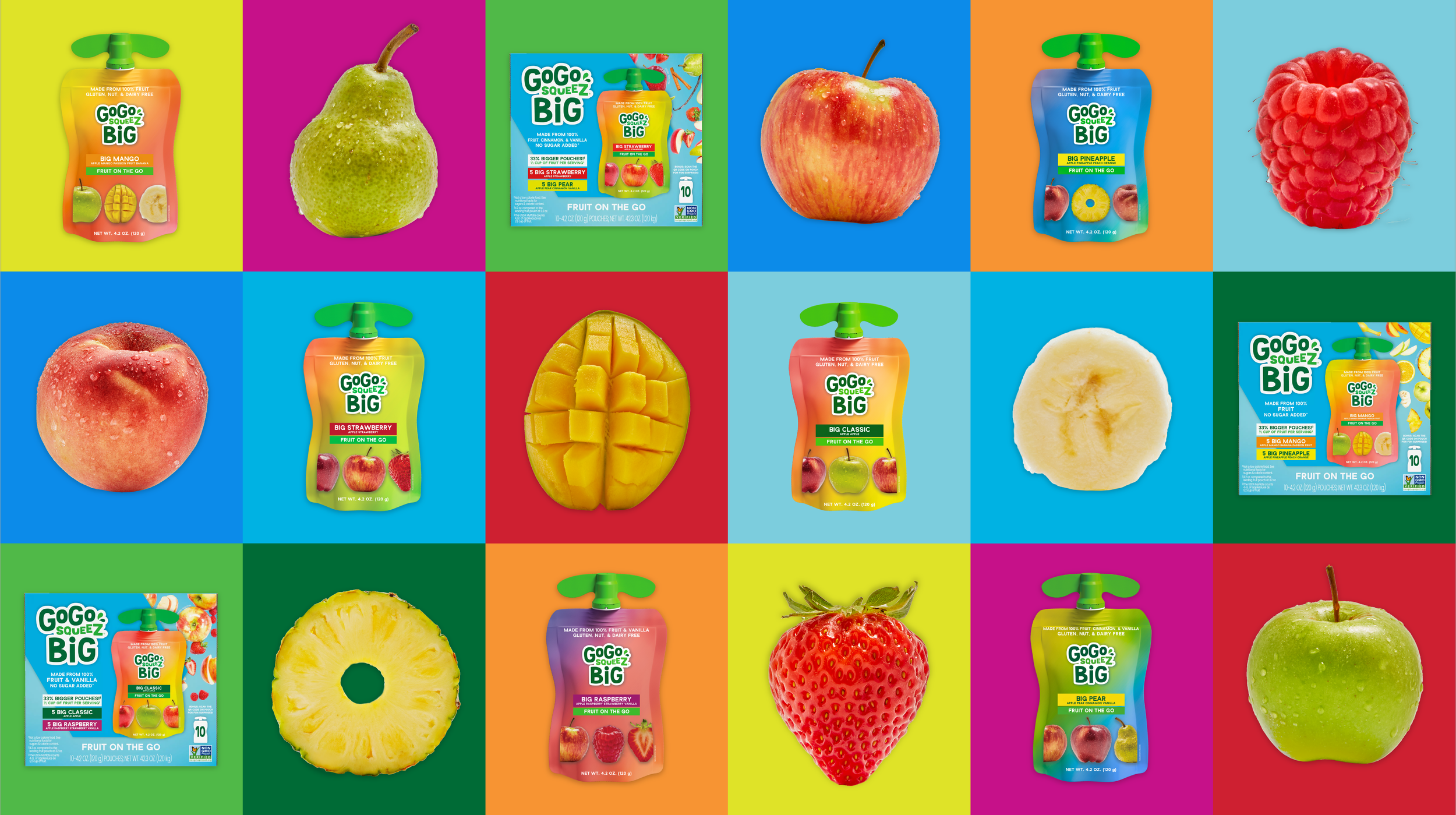
Around the age of 8, kids outgrow the GoGo squeeZ brand (and applesauce pouches in general). The iconic green GoGo pouch goes from lunchbox staple and snacktime mainstay to “mom, cringe, no thanks” seemingly overnight.
At the same time, parents and caregivers really want to keep their big kid’s eating habits on [a reasonably healthy] track– especially with snacking, and especially as these big kid appetites grow bigger and bigger. As the appetites become harder to keep up with.so they‘re seeking something to fill GoGo’s spot in the pantry. Kids and parents alike need easy, mess-free, on-the-go snack options, which is sort of GoGo squeeZ’s original niche. Overall, the opportunity to win over ‘older snackers’ was clearly a big one; the visual expressions just hadn’t hit the mark...yet.
With the struggling product range already in market, the challenge from the business was to change the packaging and branding enough to make it successful– but not so much that our Sales team would be required to sell it in as a new product (again).
This redesign needed to go from kick-off + briefing to product sitting on shelves in under 8 months.


RESULTS AND IMPACT
Based on in-house research, we found that the updated Delsym branding (both the ‘Family Comfort’ positioning and the packaging design) delivered on both business objectives and project KPIs.
BOOSTS BRAND RESONANCE: 88% of sample agreed new Delsym is a ‘brand for me’
INCREASES SHOPPABILITY: 77% of sample agreed new Delsym easier to navigate on shelf
EASE OF NAVIGATION: 85% of sample agreed new Delsym easier to find specific products within the range
DRIVES PURCHASE INTENT: 87% of sample agreed they would definitely or probably consider purchasing
PREFERRED BY CONSUMERS: 76% of respondents prefer new Delsym over old/current


